Exploring the Decomposition Tree Visual in Power BI

Struggling to get business users in sync about how to consistently slice and dice a metric in a report? Try out the Decomposition Tree visual in Power BI’s desktop version and let the end users decide for themselves.
During the requirements gathering phase of a report, try to understand how business users typically want to analyze a particular metric or individual categories. Often times it’s something straightforward like Sales as it pertains to various levels of their organizational hierarchy. In which case, you can simply make a bar chart with the ability for data consumers to drill up and down various levels of a hierarchy.
But this can be limiting as the hierarchy has to be determined in advance by the report creator. Say that a company wants to analyze their retail sales data by various item attributes, in various orders. That’s where a Decomposition Tree is ideal – it allows the end user to fully customize which order they view these attributes.
Let’s stick with the retail sales example and illustrate a couple scenarios to examine the point further.
Scenario 1
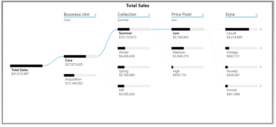
A department President for the “core” business wants to see how sales break down by Collection, then Price Point, then Style. That President has the ability to start with a blank slate and create the type of visualization seen below. Then they can start exploring the various Collections to analyze which Price Points and Styles are driving sales.

Scenario 2
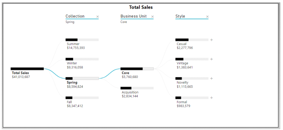
A manager for the Spring Collection wants to see how sales shake out between business units, first and foremost. Then after understanding that distribution, is interested in the Style breakdown for a given business unit.

The best part about the Decomposition Tree is that it can allow for both of these scenarios in one visual. On top of that, it’s very easy to set up in Power BI Desktop. You simply feed it a metric to analyze and drop in all attributes that a user would possibly want to see. Once published, the user has the ability to add or subtract any layers of analysis to fit their needs.
How do I incorporate the Decomposition Tree visual option into my PBI reports?
The Decomposition Tree is a unique visual because it isn’t automatically part of Power BI Desktop’s out-of-the-box visualization options. It was rolled out as part of the November 2019 release as a “preview” feature. However, current versions now have the Decomp Tree as a default option, but in case you’re working with an older PBI version here are the steps to take to enable this feature.
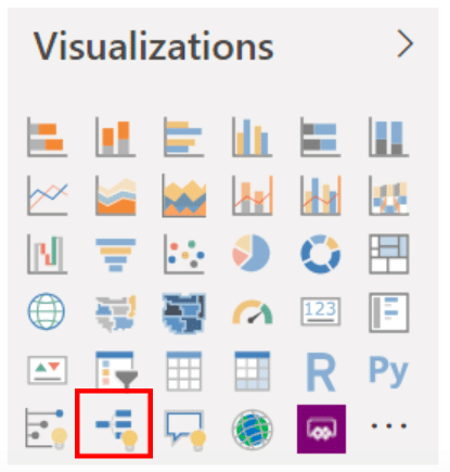
To enable this additional option, it requires going to File -> Options and Settings -> Options -> Preview features -> check Decomposition Tree Visual. It will require a restart of Power BI Desktop, but then the Decomposition Tree option will appear in your list of visualizations:


